This is the current flag of Knoxville, TN.
Until very recently I had no clue what our city flag looked like. It’s busy, visually jarring, and outdated. Also, no one knows this is our flag. Lloyd Branson’s 1896 design doesn’t represent Knoxville’s current identity.
Knoxville is…

Passionate. Spirited Storied. Hospitable. Iconic. Scruffy. Growing.
I don’t want to be completely dismissive of Lloyd Branson’s design; it has good stuff we can carry over.
The colors, although high contrast, carry important symbolism.
The L&N railroad and rail transportation in general has a long history in Knoxville. We can get rid of the busy iconography but keep the two black horizontal lines — symbolizing railroad tracks.
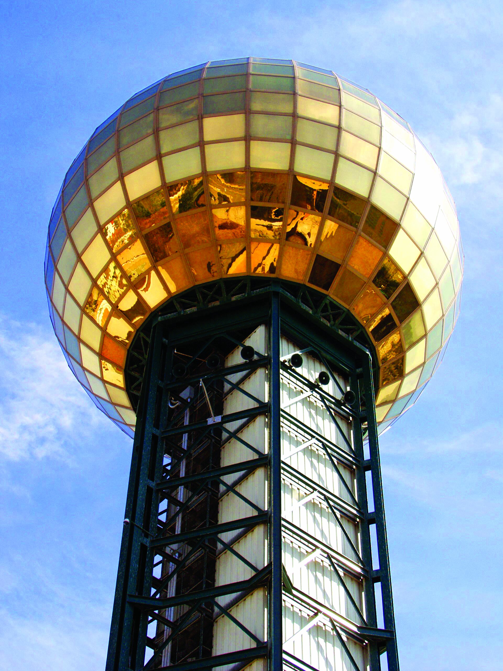
The “golden circle of progress” echoes the design of the Tennessee state flag. The Sunsphere, built for the 1982 World’s Fair, has become an iconic landmark associated with Knoxville. It also happens to be golden.
Tennessee State Flag, iStock
Knoxville Sunsphere, VisitKnoxville

With these insights, let’s see what we can do differently.

This is my proposed Knoxville Flag Redesign.
By lowering color contrast, the design becomes less visually jarring.
Geometric traits of the original 1896 design are carried over, honoring Knoxville’s past.
Characteristics are modernized to encapsulate Knoxville’s current and future identity.
Branson’s “golden circle of progress” continues to take center stage. Its refresh represents Knoxville’s eternal passion, bravery, manufacturing, Volunteer spirit, agriculture, and the iconic Sunsphere landmark. It’s also placed in the eastern third of the flag, representing Knoxville’s geographic location in relation to the state of Tennessee.
City iconography has the opportunity to be consistent with this flexible and simple design. For example, the existing City of Knoxville logo can gracefully evolve with this identity.
Current City of Knoxville Logo
Proposed Rebrand
Design transformed into Sunsphere


